
Visual Design & UX/UI
Visual identity and UX for the Madrid Fusión 2021 website
I was responsible for the visual design and UX/UI of the Madrid Fusión 2021 International Gastronomy Congress website. This included defining and designing registration and payment flows aimed at conversion and improving the user experience.
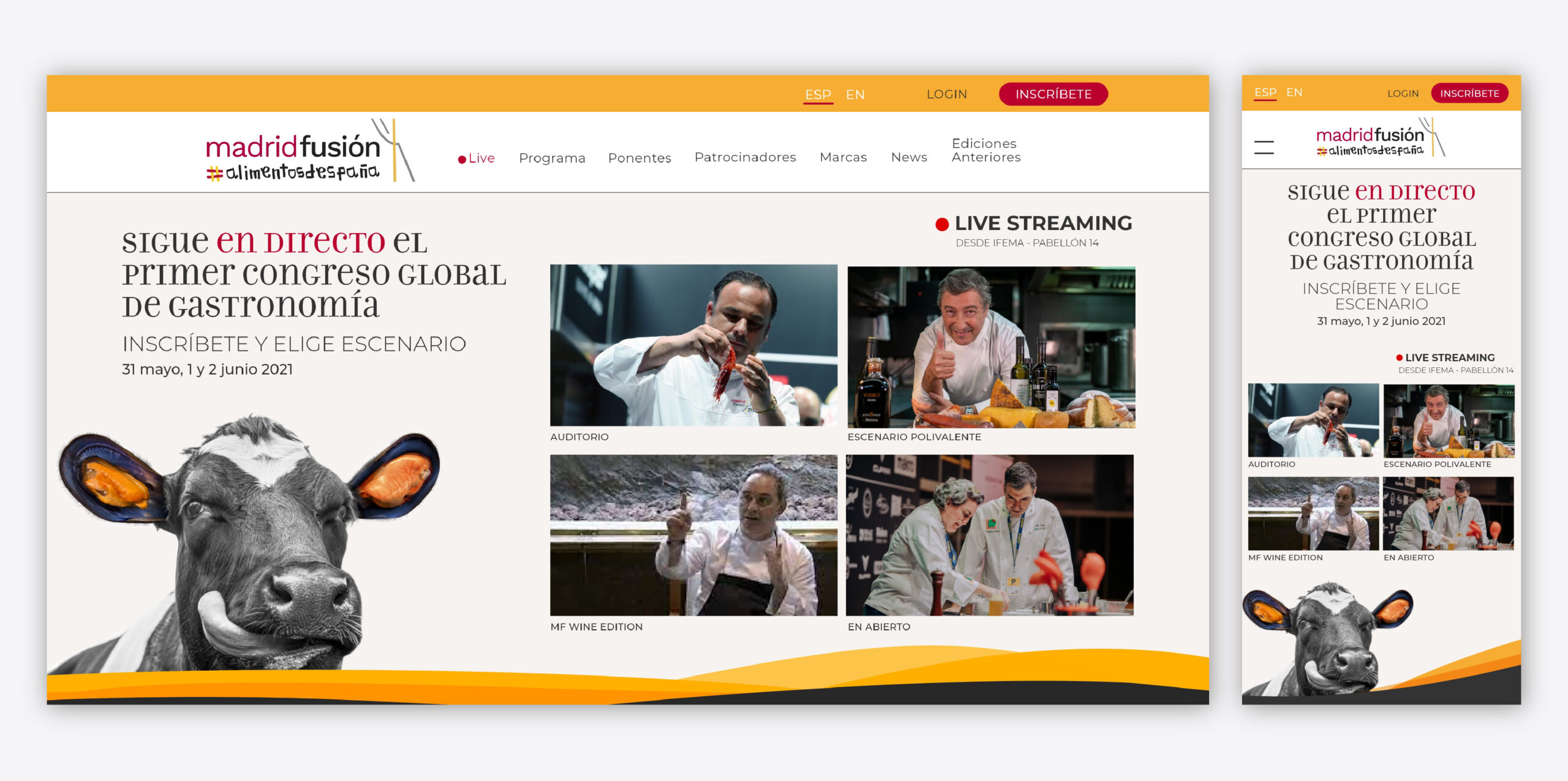
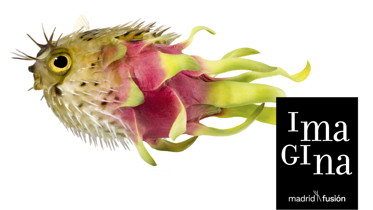
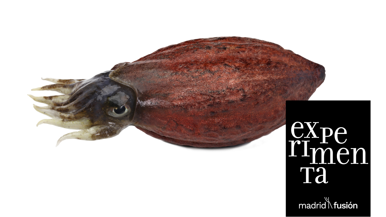
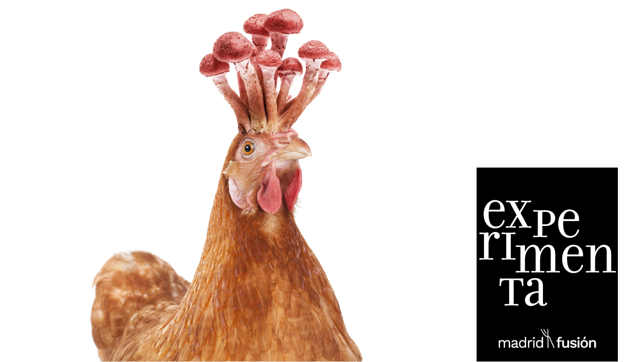
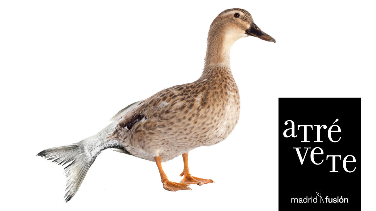
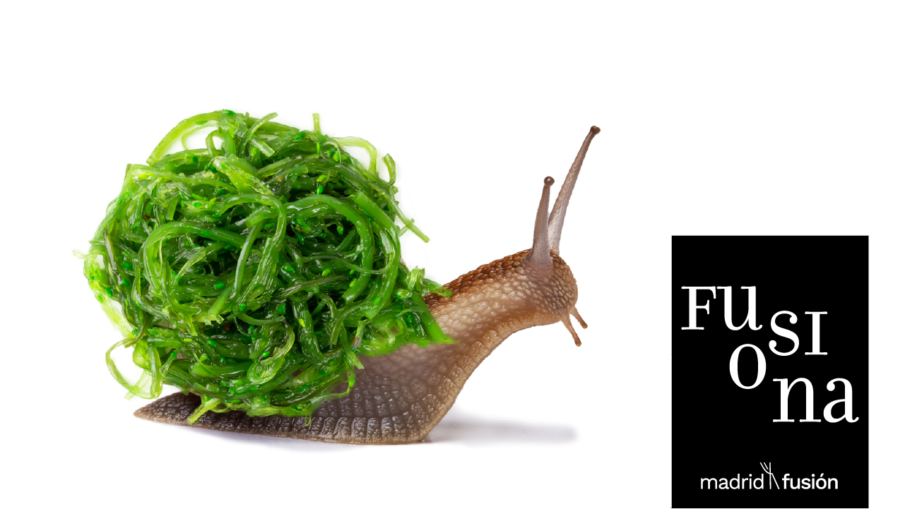
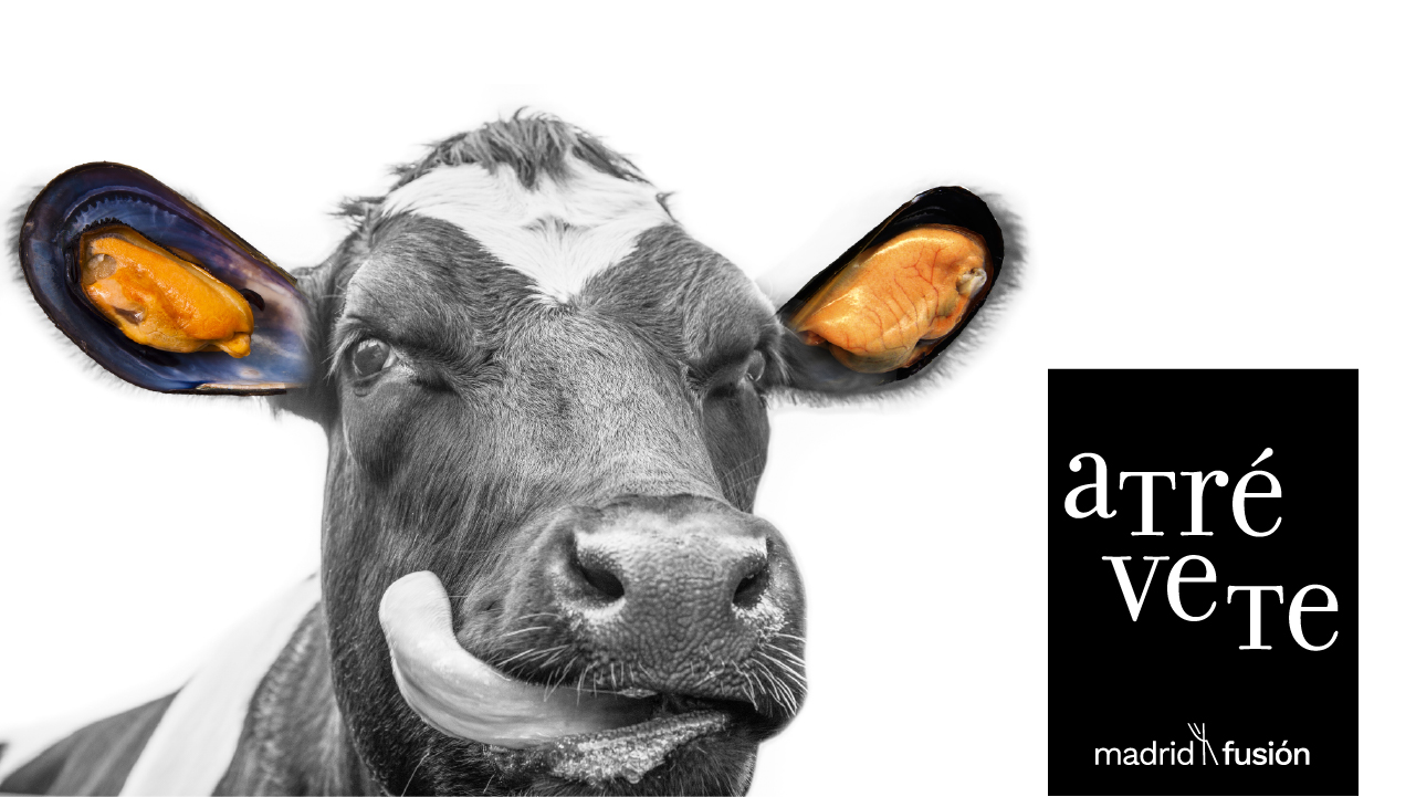
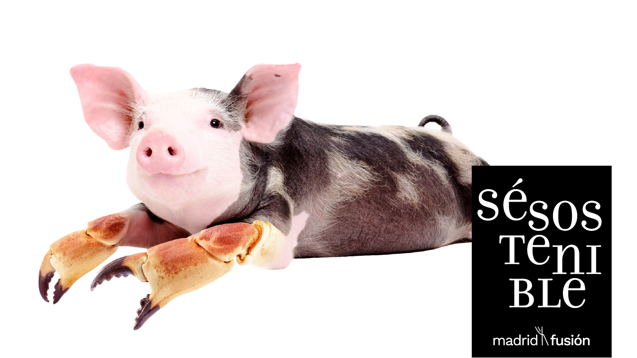
In terms of visual design, I created a series of conceptual graphics fusing ingredients and raw materials, such as a cow with mussel ears, a cuttlefish with cocoa and a snail with nori seaweed, to reflect the idea of ‘fusion’ and the congress’s slogan, ‘Circular Gastronomy’.
The project combined user-centred design and brand identity with a responsive interface, working in collaboration with the marketing and development teams using Agile methodology.


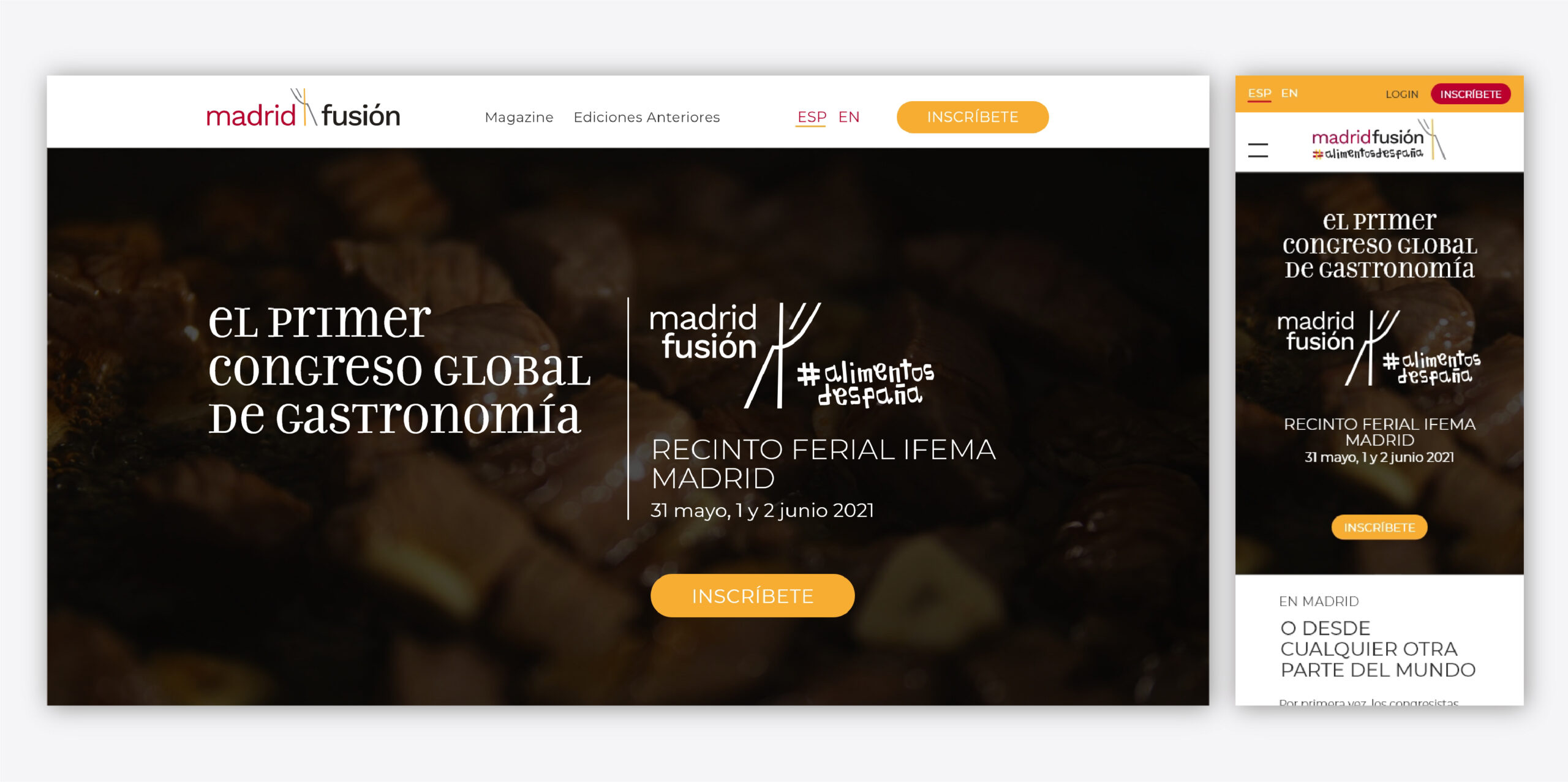
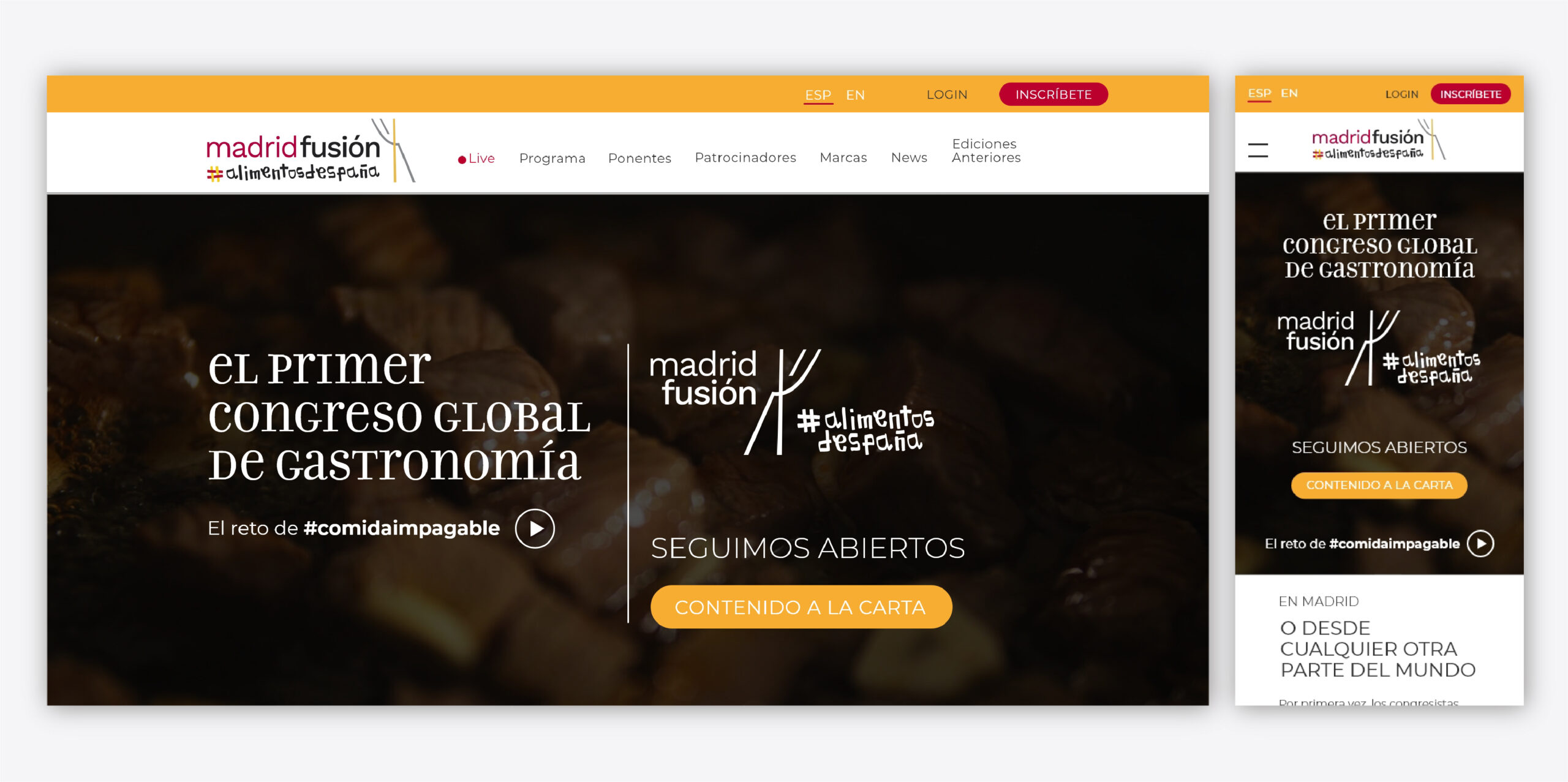
Home versions for the three phases of the event
A home that evolved with the event
The homepage had to be updated in line with the event, covering registration, streaming and thank you phases
Client
Madrid Fusión
Date
2021
My Role
UX/UI Design · Visual Design · User Flow · Wireframing · Responsive Web
Madrid Fusión is a world-leading event in the gastronomy sector. It combines lectures, experiences and culinary exhibitions, focusing on innovation, sustainability and global food trends. It is part of the Vocento publishing group
Creative development
The key to the creative development was to convert the impact of the taste sensation of trying something daring and different into a visual impact by combining foods in their raw state (alluding to the ‘Circular Gastronomy’ theme edition) and serving them with with deconstructed words
My main responsibilities
-
Design UX/UI interfaces for a fully responsive website aligned with Madrid Fusión’s branding.
-
Develop user flows and wireframes for registration, ticket selection, payment, and confirmation steps.
-
Enhance user experience and reduce friction, ensuring a smooth onboarding and checkout process.
-
Apply Agile methodology and collaborate with marketing and development teams to integrate business and user needs.
-
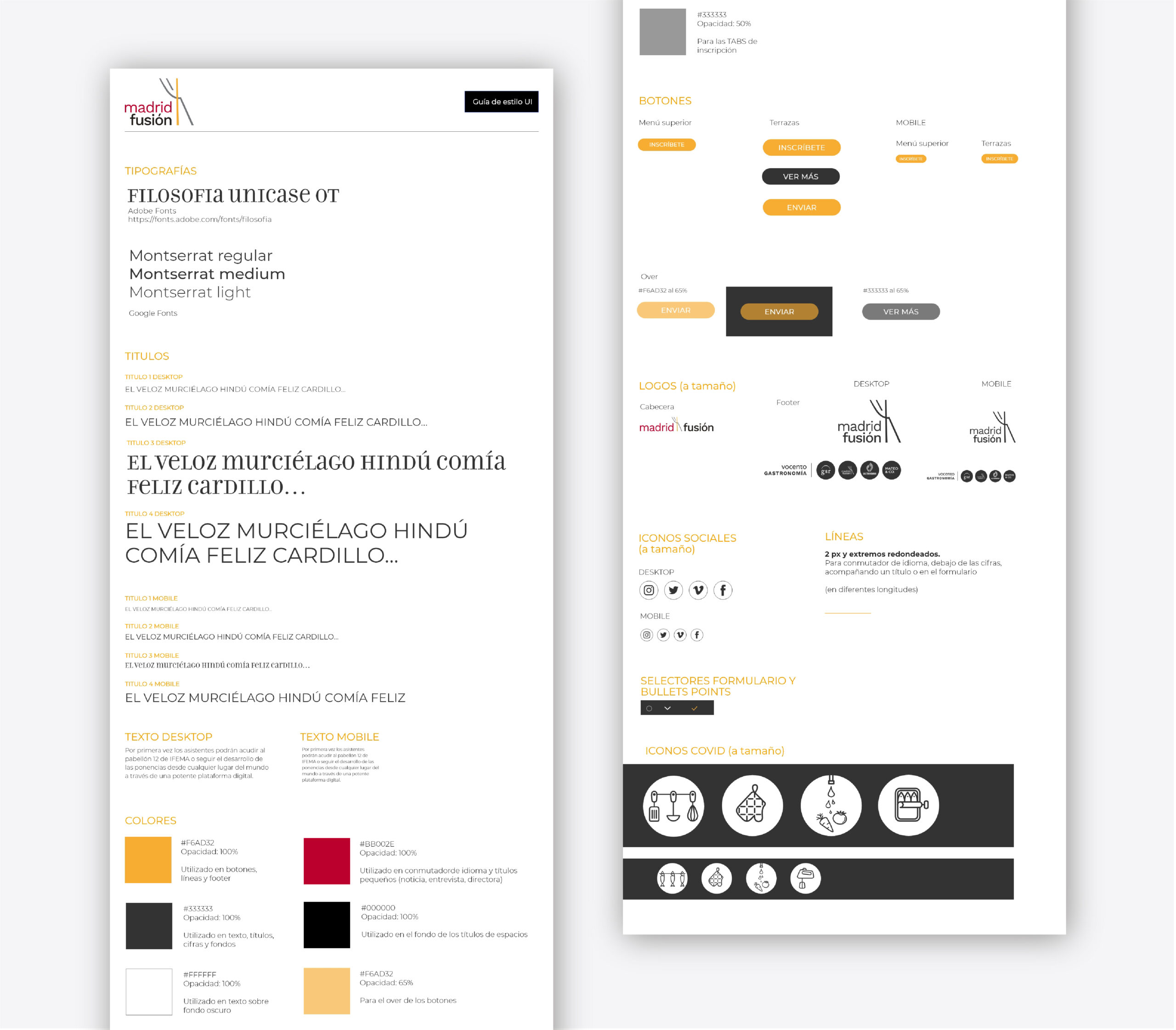
Create a cohesive visual style guide and reusable design components to maintain brand consistency across all digital touchpoints.
Website flow
The flow consists of five main stages:
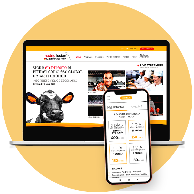
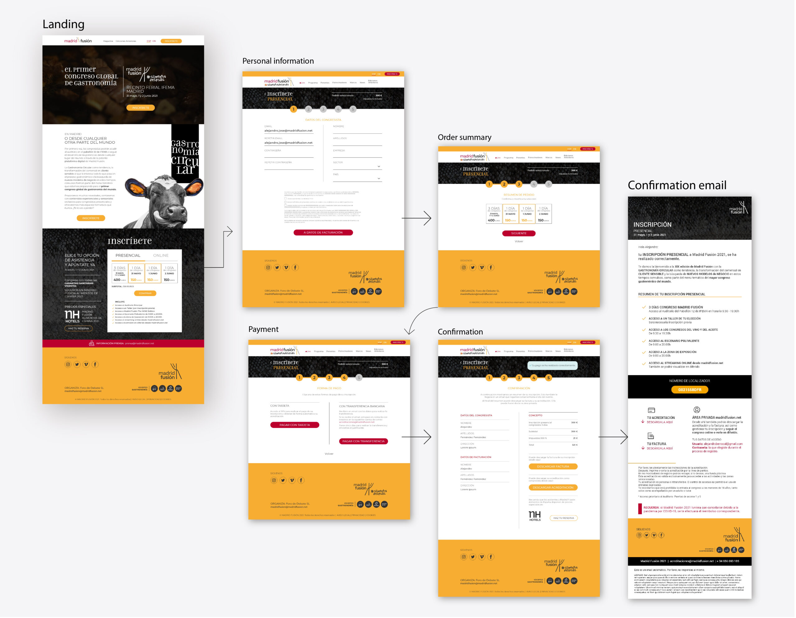
- Landing page: This presents the attendance options (in-person and online) and details the prices and benefits, while integrating the visual concept of the campaign.
- Personal information: The registration form is optimised to minimise errors and facilitate user progress, bearing in mind that registration is likely to be both corporate and personal.
- Order Summary: Allows the user to review and edit the order before proceeding to payment, with a breakdown of options and fees.
- Payment: Secure payment gateway for card or bank transfer payments.
- Confirmation and email: An automated confirmation screen and email containing a summary of the registration, invoice and downloadable accreditation.
The design strikes a balance between usability and branding, maintaining consistency with the ‘Circular Gastronomy’ visual campaign. Clear calls to action and a visual hierarchy have been incorporated to improve ticket sales, which can reach €400.
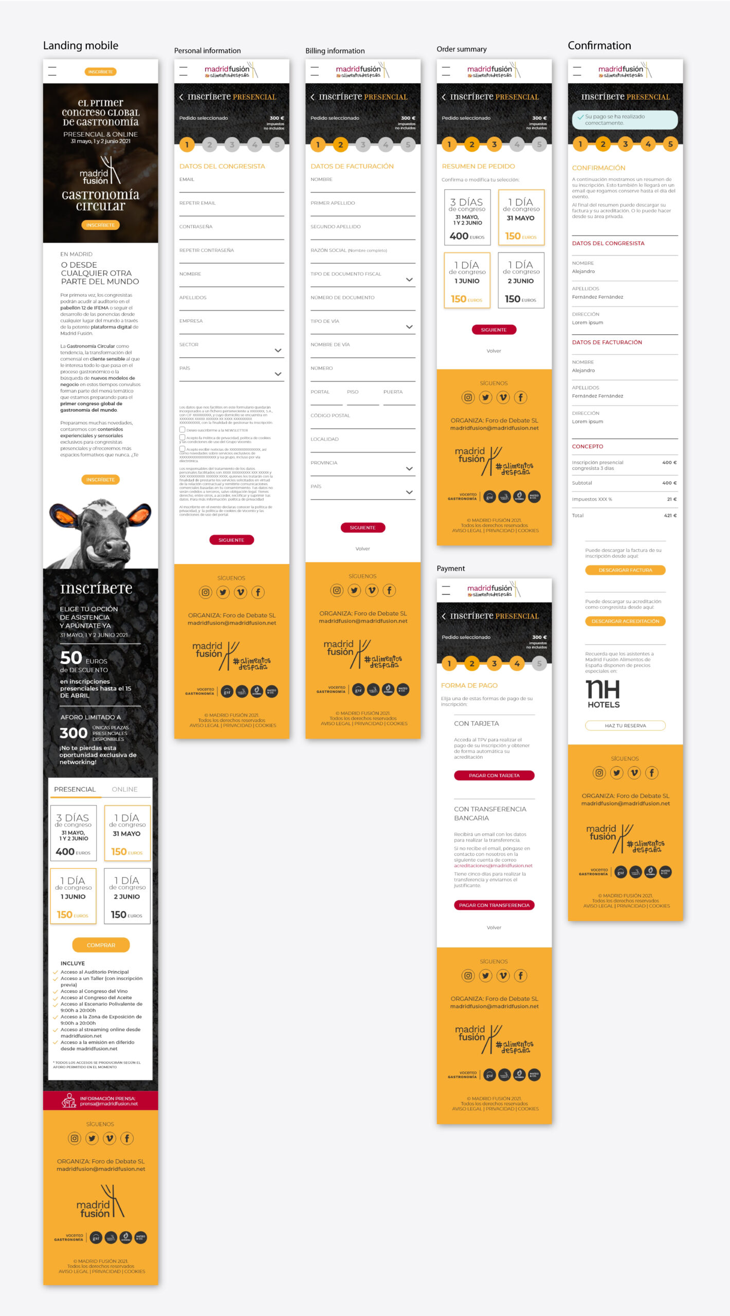
The mobile version was designed according to responsive UX principles:
I was also responsible for designing the emails that were part of the flow:

Visual and Conceptual Creativity
The challenge was to translate the impact of the taste of culinary surprise — that moment of discovery when trying something daring and different — into the visual realm. I created compositions combining raw materials from different origins, such as a cow with mussel ears or a cuttlefish fused with a cocoa pod, to symbolise unlimited creativity and the circularity of the gastronomic process.
These images were accompanied by deconstructed words to reinforce the conceptual interplay between form, substance, and flavour, and to invite viewers to experiment, imagine, and dare.
UX/UI design and web architecture
The project included defining a deep and hierarchical information architecture focused on accessibility, content discovery, and SEO optimisation.
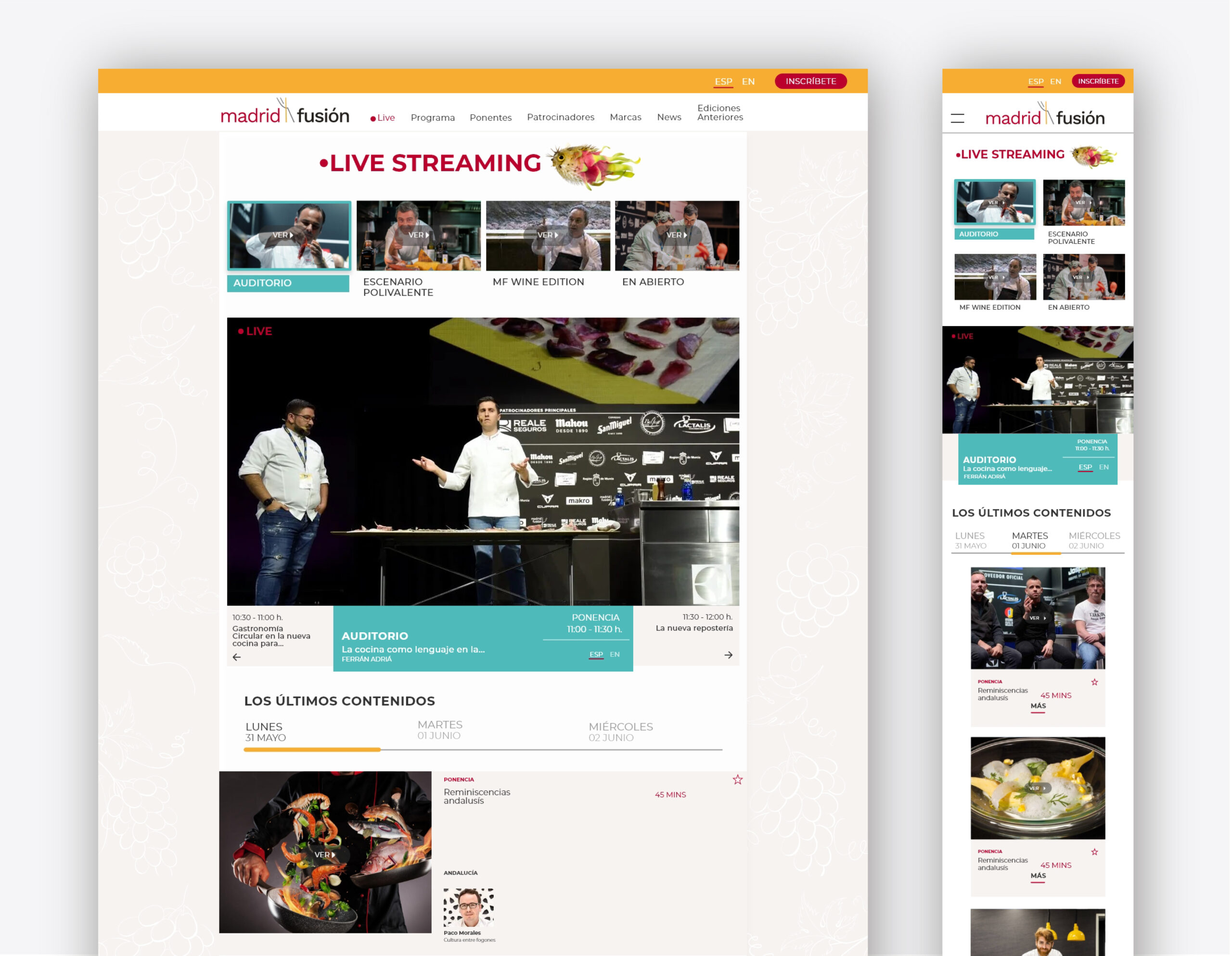
- The streaming subpage was designed for the live broadcast of presentations from the four conference stages. It featured a registration-based access system and an on-demand video repository that was accessible after the event.
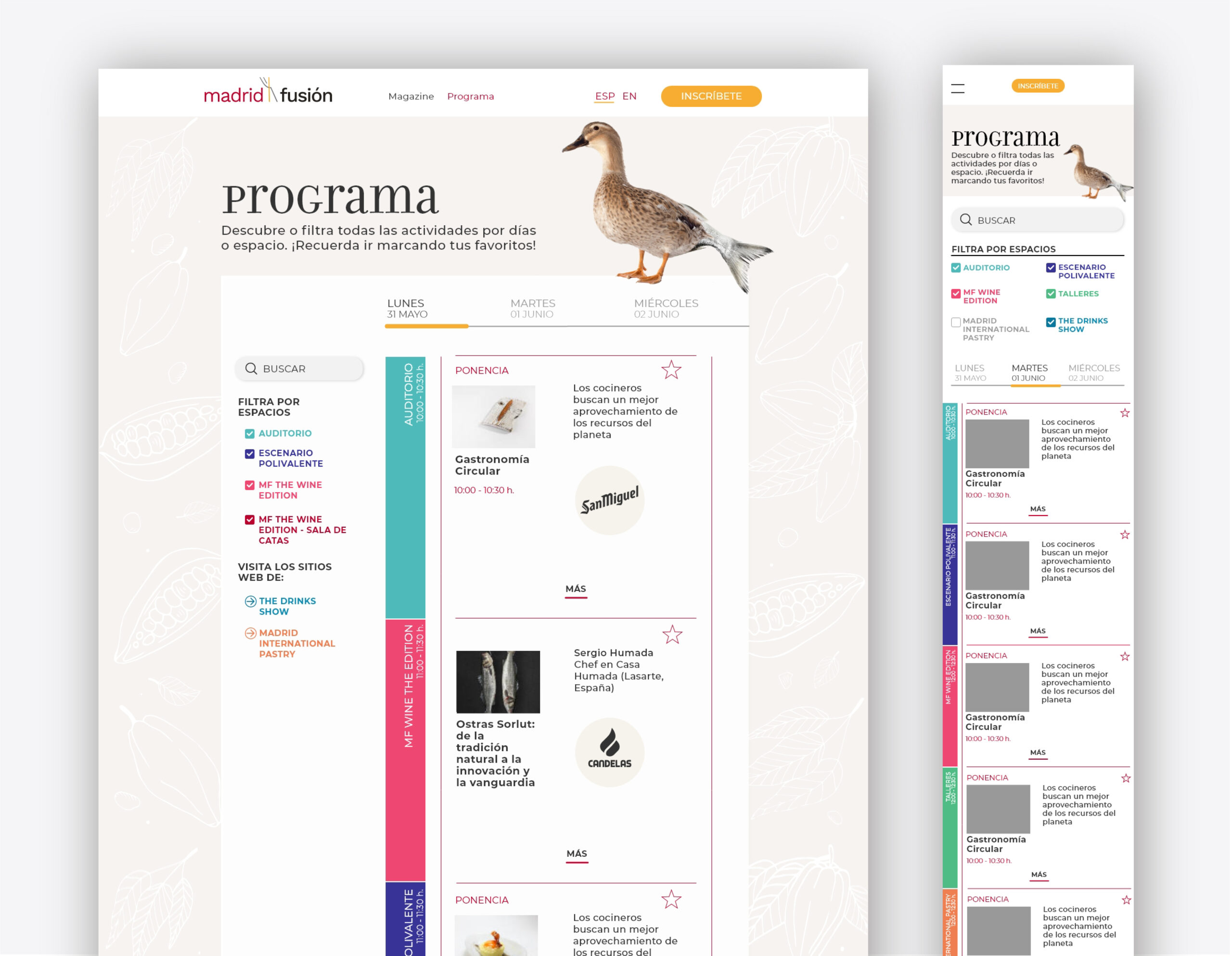
- The programme subpage was structured by thematic categories and days to facilitate the search and filtering of relevant content through modular, responsive navigation.
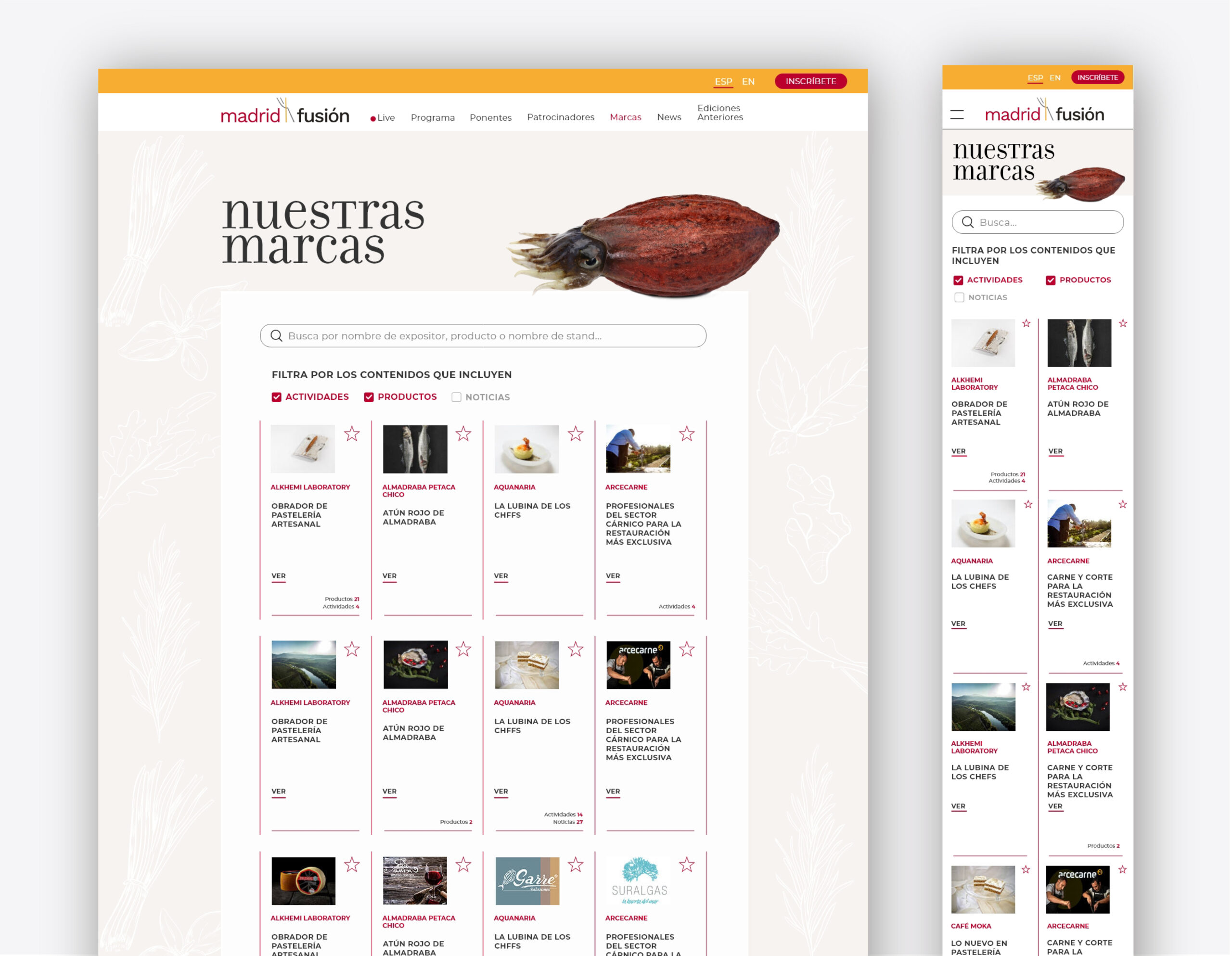
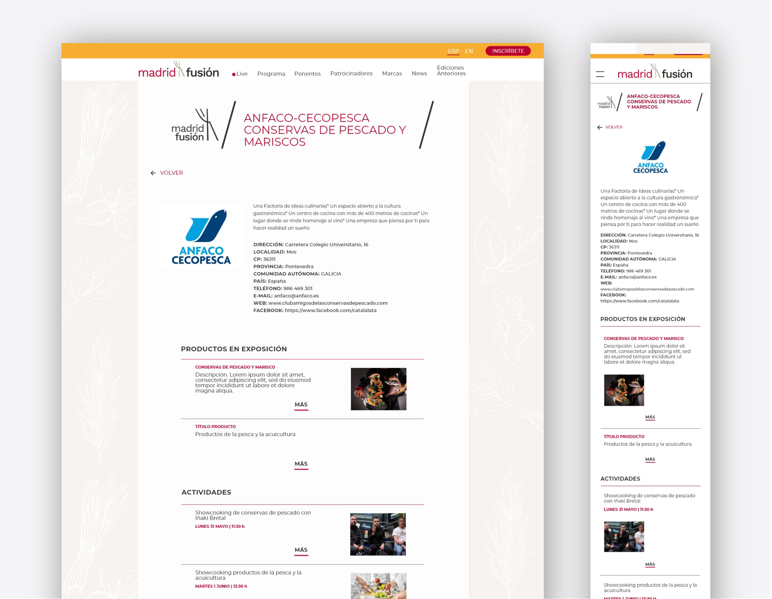
- The ‘Our brands’ subpage is a space dedicated to exhibitors, sponsors and collaborators. It features dynamic files containing products, news and activities, which boosts the visibility of the brands and their connection with attendees.


Customised error pages were designed for 404 and 500 errors to maintain visual consistency and brand tone. The aim was to offer a polished user experience, even in the event of an error.