
Event design
An event for everyone
Go Family is a family event with a fresh, friendly and universal image. Based on the MujerHoy logo, I created a visual universe full of charming metaphors — trainers, balloons, macarons with faces — that convey diversity and joy. Every piece, from the banners to the invitations, is designed to make the experience as easy and welcoming as the event itself.

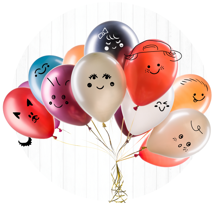


versions: trainers and macarons with faces
Print Campaign
The advertising campaign portrays diverse families in a warm and friendly manner, free from stereotypes


Client
Mujerhoy
Date
2019-2022
My Role
Visual Design · Web Design · Campaign Design · Signage
Mujerhoy is a Spanish women’s magazine published monthly by the Vocento group. It offers content on fashion, beauty, health, psychology, lifestyle and leisure, as well as interviews with notable women.
Visual Identity
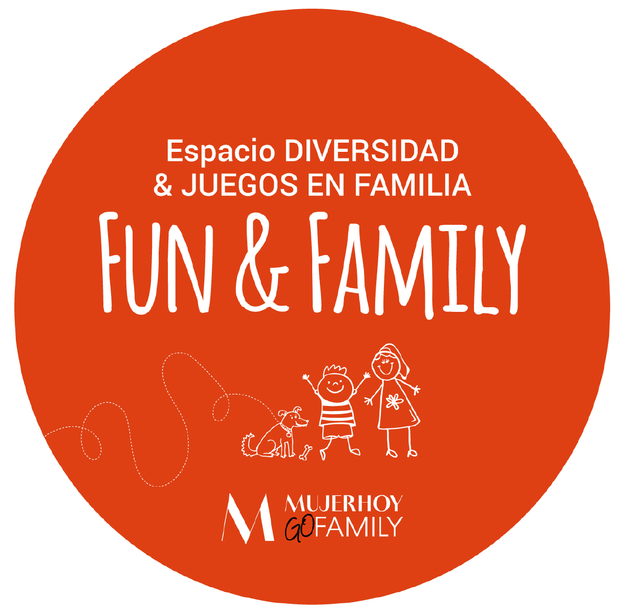
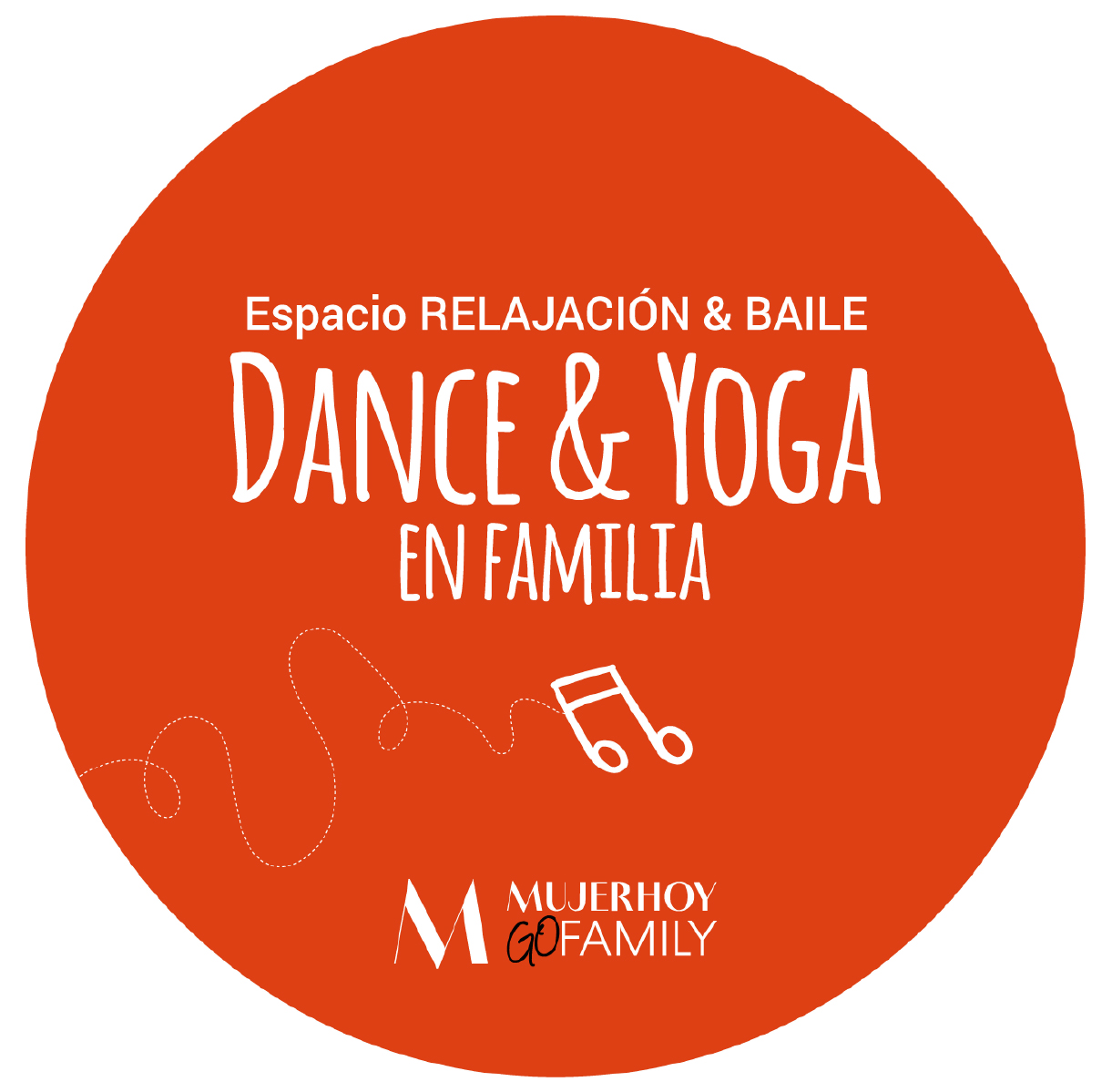
My job was to develop a visual identity that was consistent with the Mujerhoy brand. This involved integrating the logo and creating a new seal (‘Go Family’) to emphasise the event’s playful and approachable nature.
Creative Concept
To ensure the inclusion of all types of families, creativity was based on universal visual metaphors: trainers of different sizes illustrated with smiley faces, balloons or macarons with friendly expressions.
These elements represented diversity without resorting to stereotypes, creating a warm, friendly and recognisable aesthetic. All the graphics were designed with a clear structure, prioritising the date, location and registration call to action (CTA).
Website
The design uses graphic elements that are consistent with the campaign, such as visual metaphors, illustrations and a warm colour palette, as well as a clear hierarchy that makes the website easy to read. The main sections include a description of the event, featured activities, a location map, and a CTA button directing users to the registration form.

I also worked on the registration process, which was optimised for a free event with capacity control. I designed a clear and accessible experience that allowed each family to download personalised invitations with their own unique QR code. This facilitated access and control on the day of the event.

After completing registration, users receive an automatic confirmation email, designed specifically for mobile and desktop, which includes:
-
Confirmation of complete registration.
-
A download link for the family invitation, with individual QR codes for each attendee
-
Practical information about the event, such as the schedule, location, recommendations and access

The importance of signage at events with multiple activities
This visual clarity is essential in order to encourage autonomy, minimise congestion, and ensure that every point along the route is accessible and welcoming.

Design of the agenda
The design of the agenda was crucial for a full-day event involving multiple activities, craft workshops and contests taking place in different locations within GoFamily. Its visual structure clearly displayed titles, timetables and locations, ensuring readability, a clear information hierarchy and quick access to content
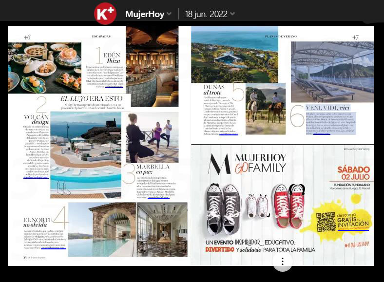
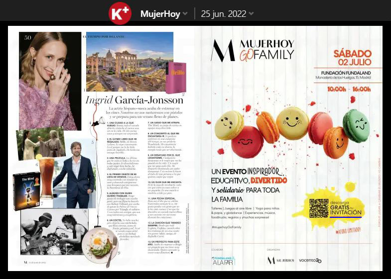
Print campaign
Go Family print campaign was designed to maximise the visibility of the event, taking advantage of the wide reach of Vocento’s main media
Mujer Hoy, XL Semanal, ABC…

Digital Campaign
The print campaign was adapted for a variety of display formats
They included 300×600, 300×250, 120×600, 980×90, 300×100 and 320×50. The key information, such as the date, location, time and call to action to download free invitations, was always kept legible.
email campaign to attract registrations
The design prioritised a modular structure with a highly visible call to action (CTA) that led directly to the registration form. The combination of familiar images, approachable copy, and an optimised visual hierarchy immediately conveyed the educational, fun, and charitable nature of the event, resulting in high open and registration rates.
