
UX/UI design - Digital Campaign - newsletter
Cross-functional project combining UI/UX, editorial and advertising design
I took part in the UI/UX redesign of WeLife (Vocento), defining the new editorial structure (‘Body’, ‘Mind’ and ‘Planet’) and designing scalable content modules. I developed the architecture and UI for the Experts/Opinion new sections. I designed display campaigns for Vocento’s digital network and created the complete design for the portal’s mobile-first newsletters.


Client
Welife
Date
2023-2025
My Role
UX/UI Design · Creative Concept & Digital Campaign Design · Editorial Design
WeLife is a wellness and sustainability editorial portal from the Vocento media group. It offers content and experiences related to the body, mind, and planet. Its mission is to encourage more conscious and healthy living.
UI/UX
At WeLife, I was responsible for developing multiple phases of UI/UX design. This began with the strategic reorganization of the homepage to integrate the new key areas of the portal: Body, Mind and Planet. I designed modular blocks comprising a main piece and two to three additional news items in 1:1 and 16:9 formats to offer the editorial team greater versatility and ensure a dynamic, adaptable, content-oriented homepage.
I also designed the Experts section, which will evolve into Opinion in 2025. I defined its structure, content architecture and look and feel.
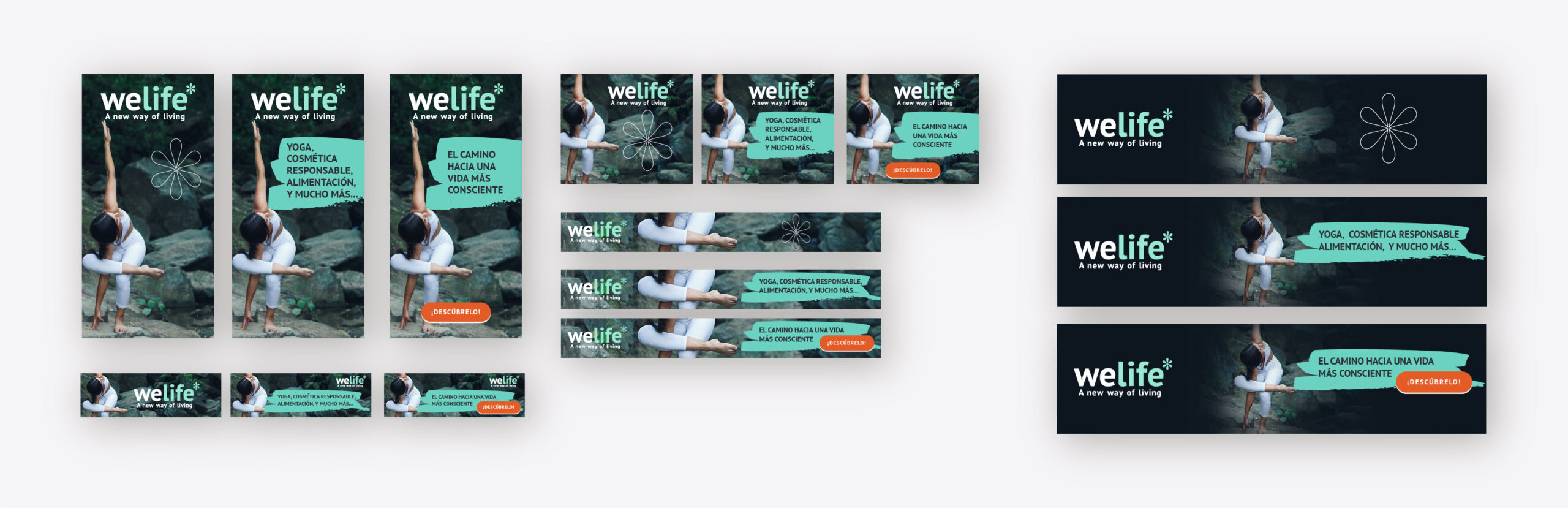
Digital Campaign
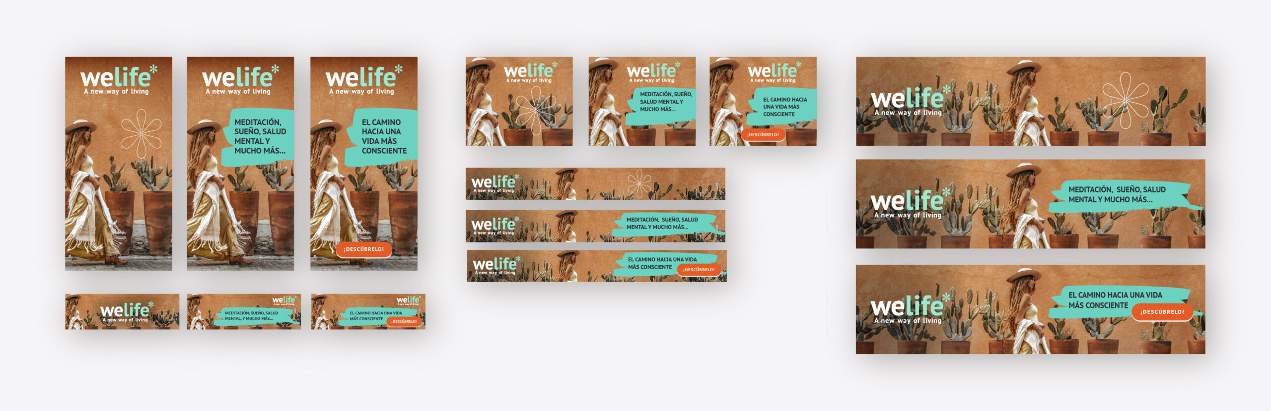
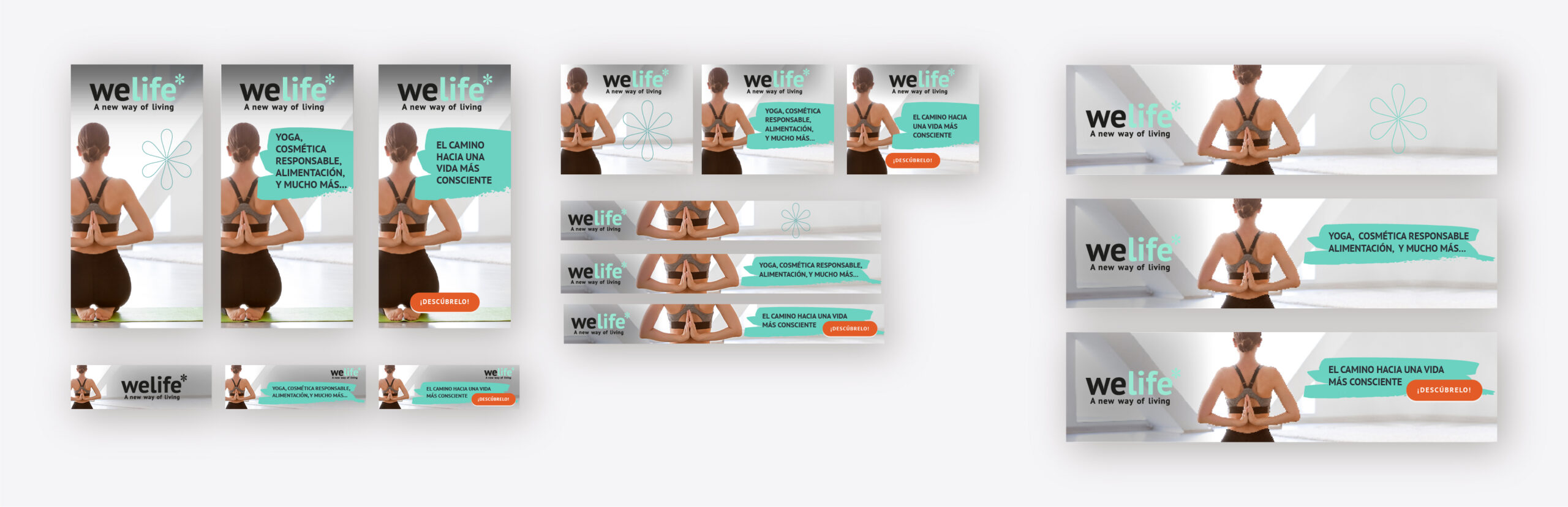
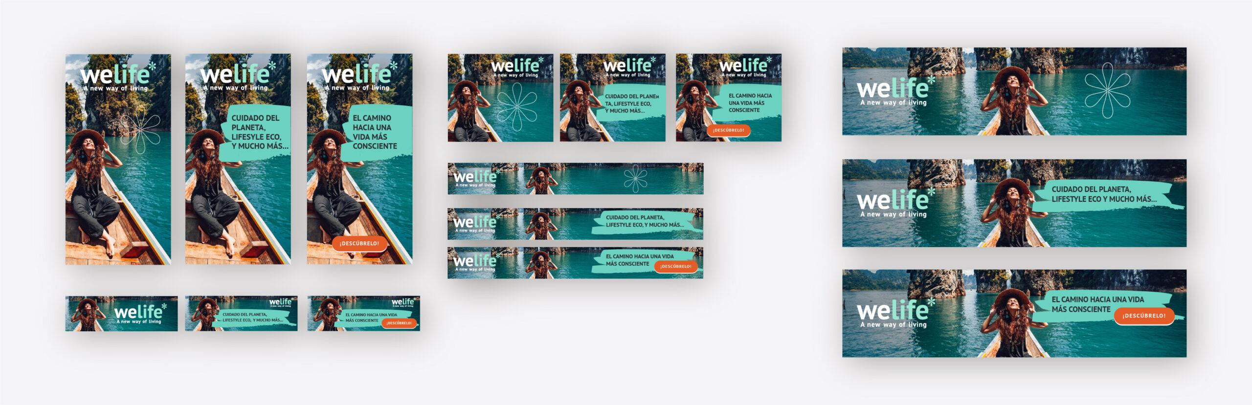
It combined aspirational photography, natural colour palettes and the brand’s signature mint green to reinforce its wellness ethos.
I developed four creative lines showcasing a distinct photographic style: natural outdoor scenes, minimalist interiors, a boho aesthetic, and outdoor yoga. The modular composition focused on the image and provided clean space for text and a clearly highlighted CTA to improve conversion.
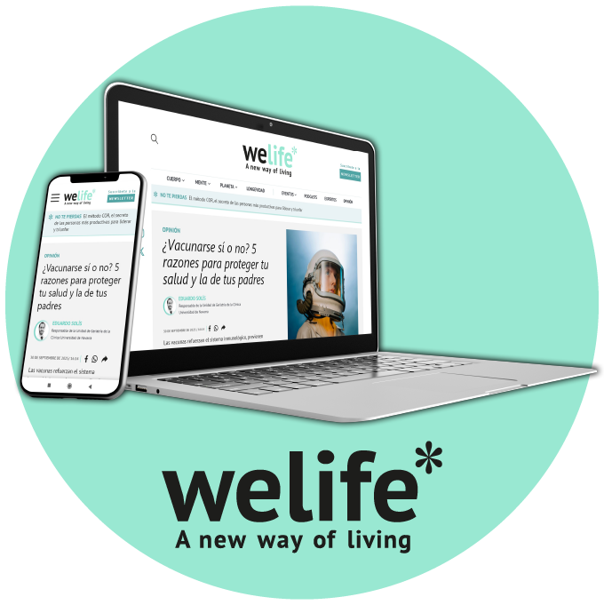
Welife’s editorial newsletters
I designed the editorial newsletter with a mobile-first UI/UX approach, optimising readability on small screens. It maintains a clear and spacious structure, based on modular blocks that facilitate information hierarchy and allow the user to navigate comfortably between content on ‘Body’, “Mind” and ‘Planet’, a Welife character and a recommendation.
Website
Each section of the website uses modular blocks where main articles are highlighted alongside smaller ones, such as 1:1 or panoramic images. This modularity gives the editorial team the flexibility to publish varied content:

There is an ‘Experts’ section that emphasises editorial authority, showcasing profiles, expert articles and opinions, which consolidates the portal’s credibility

Each expert entry includes a title, the expert’s name and the topic, as well as a brief synopsis of the content, making the article easy to navigate and read quickly. A detailed biography of the expert and a link to their website or social media profile can be found at the end of the article.

The current ‘Experts’ section is set to evolve into a fully redesigned ‘Opinion’ section, designed to enhance the reader’s experience and reinforce the authority of each piece of content. Each article will feature a carefully selected main image accompanied by the title, the name and position of the specialist, and an editorial introduction that provides context and makes the article more intuitive to read. This new visual and narrative structure will enable readers to instantly recognise the author’s relevance, grasp the article’s focus, and enjoy an aesthetically pleasing, contemporary reading experience that aligns with WeLife’s editorial quality standards.

Print campaign
The design incorporates graphic elements typical of branding, such as aspirational images and finely drawn flower, to generate recognition.
A modular composition was applied to ensure optimal performance in display ads, focusing on the image and providing clean space for text and a clearly highlighted call to action (CTA) to improve conversion. Each creative was designed to adapt efficiently to all the formats required for the campaign, ensuring visual cohesion and optimal performance in both mobile and desktop environments.


Editorial Newsletters
Strikes a balance between featured articles, micro-content, and calls to action. A combination of 1:1 and 16:9 images is used to make the newsletter dynamic and ensure the editorial team has flexibility. The visual elements — floral lines, mint green accents and clean headlines — reinforce the brand’s calm and contemporary style. The design prioritises recirculation to the website with tactical blocks that encourage discovery of further articles and related topics.
The editor’s newsletter